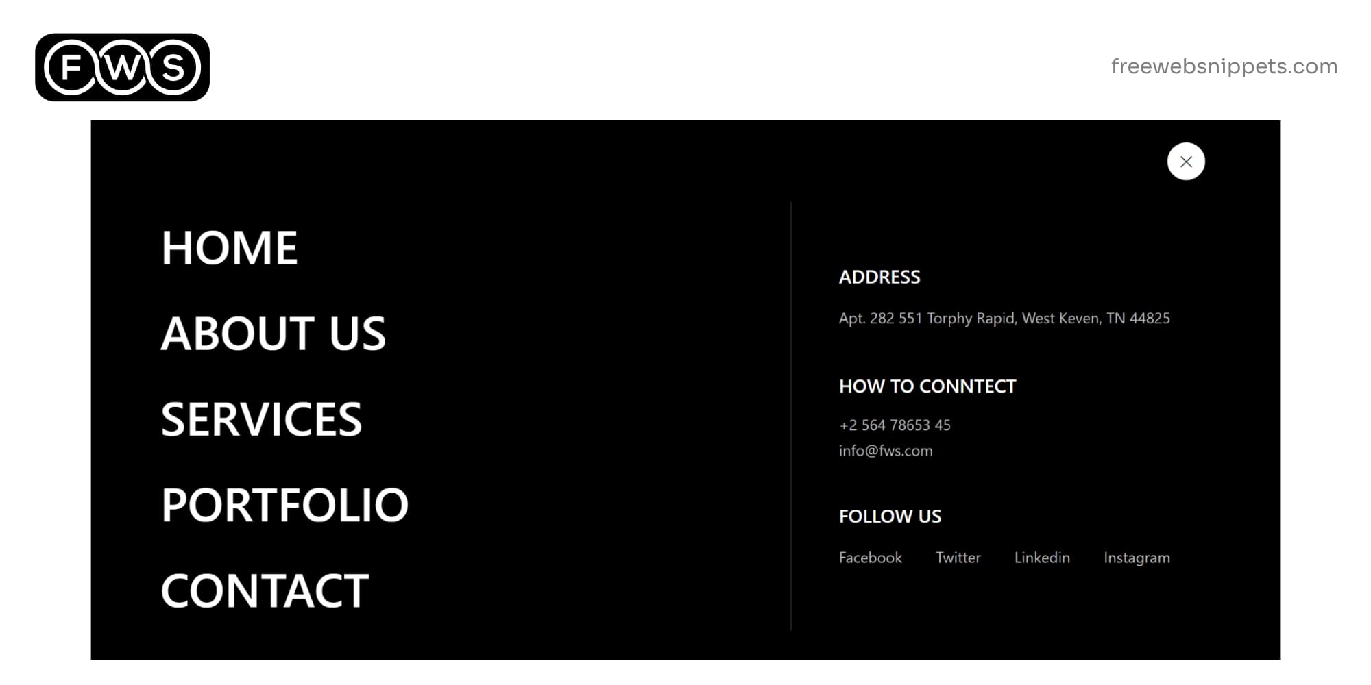
Responsive Bootstrap 5 Header Snippet with Dropdown & Navbar Toggler
Download this responsive Bootstrap 5 header snippet featuring a collapsible navbar, dropdown menus, and a customizable design for your website.
The Bootstrap 5 header snippet presented here is a versatile, responsive, and customizable solution for creating professional and modern website headers. This snippet, built using HTML, CSS, and Bootstrap 5, offers a clean and minimalist design that can be easily integrated into various web projects. This header snippet is fully responsive, making it suitable for all screen sizes, from desktops to mobile devices. The responsive nature is achieved using Bootstrap 5’s grid system and media queries, ensuring that the header looks great on any device. The snippet includes a collapsible navbar, which automatically converts into a vertical menu for mobile devices, offering a seamless user experience.
Make a Comment
Your email address will not be published. Required fields are marked *