Responsive Bootstrap Header with Dropdown Menu
Build a responsive header using Bootstrap 5 with a dropdown menu and a 'Get In Touch' button. Learn how to create a mobile-friendly sticky header for websites.
Responsive Bootstrap 5 Header with Dropdown Menu and 'Get In Touch' Button
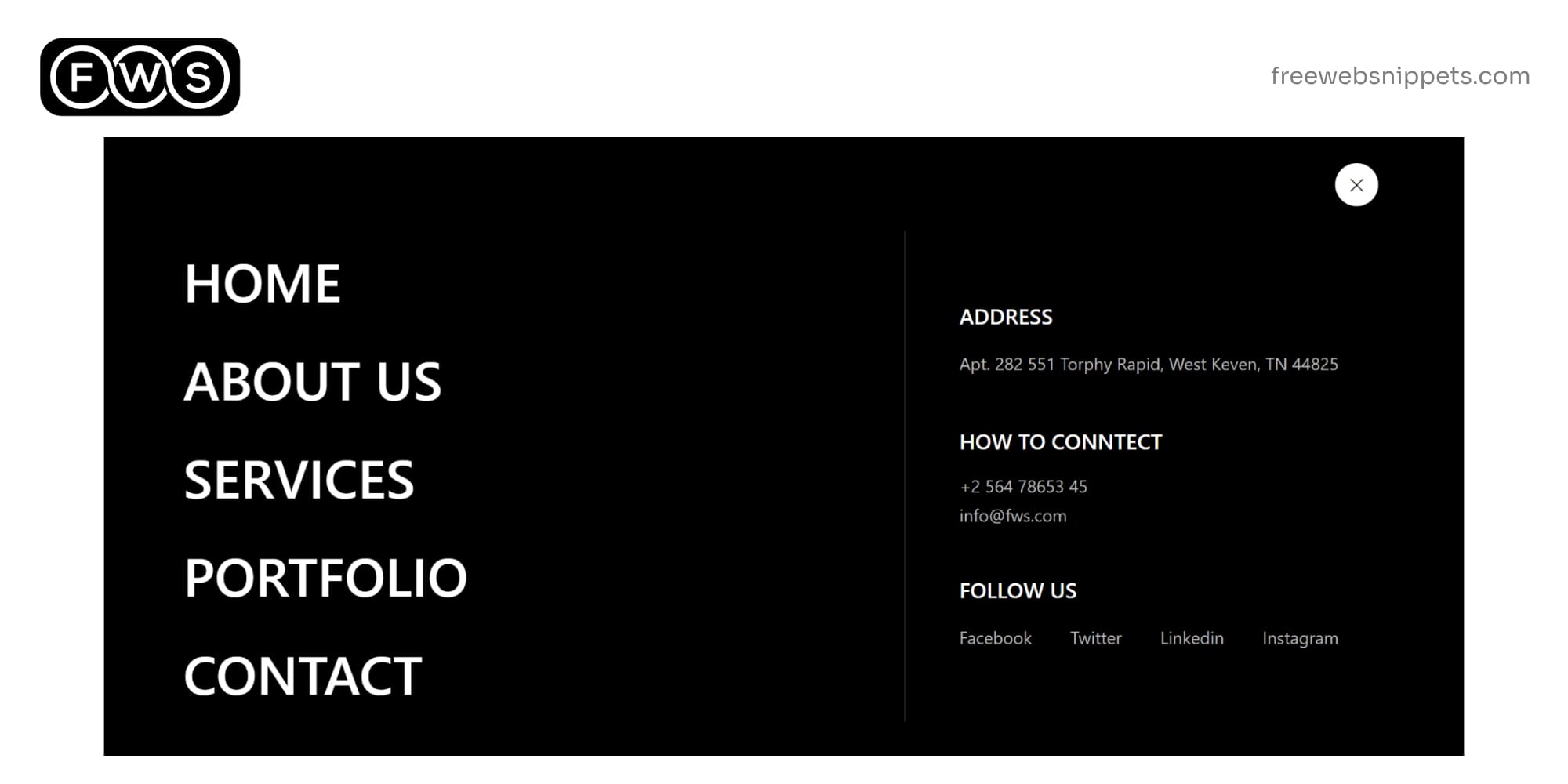
Designing a modern and responsive Bootstrap 5 header is essential for creating a user-friendly website. A well-crafted header ensures seamless navigation across various devices, allowing users to easily access key sections of the site. In this guide, we’ll show how to implement a header with a dropdown menu and a Get In Touch button, using the latest version of Bootstrap.
Why Choose Bootstrap 5 for Your Header?
Bootstrap 5 is one of the most widely used CSS frameworks due to its flexibility and ease of use. It offers a wide range of components, including responsive navigation bars that adapt seamlessly to different screen sizes. This ensures your website looks great on desktops, tablets, and smartphones. By utilizing Bootstrap 5, you can quickly build a professional-looking sticky header that is both functional and visually appealing.
Key Features of the Bootstrap 5 Header
This Bootstrap 5 header includes several important features that enhance both design and usability:
- ▹ Responsive Layout: The header automatically adjusts its layout to fit different screen sizes, providing a smooth navigation experience across all devices.
- ▹ Dropdown Menu: A dropdown menu allows for easy access to additional links without cluttering the main navigation bar.
- ▹ Get In Touch Button: A prominent Get In Touch button encourages visitors to contact you, increasing user interaction and potential leads.
Creating a Mobile-Friendly Header
One of the key advantages of using Bootstrap 5 is its mobile-first approach, ensuring that your header looks great on small screens. The navbar collapses into a toggler button on smaller devices, and when clicked, it reveals the menu items in a vertical list. This makes the website easy to navigate on smartphones and tablets, improving the overall mobile user experience.
With Bootstrap's built-in grid system and media queries, the header automatically adapts to different screen sizes, ensuring that your navigation bar remains clean and easy to use on any device.
SEO Benefits of a Well-Designed Header
A well-optimized sticky header can contribute to better SEO rankings by improving user experience and site structure. Search engines favor websites that provide excellent usability, and having a properly coded responsive header helps ensure that your site is easy to navigate.
Using clear, descriptive HTML tags and incorporating keywords in key elements such as links and button text can improve the SEO of your website. For instance, including a Get In Touch button can help attract users looking to contact you, while a clear dropdown menu improves site organization, making it easier for search engines to crawl.
Conclusion
In conclusion, a well-designed responsive Bootstrap 5 header with a dropdown menu and Get In Touch button is essential for creating a user-friendly website that is both mobile-friendly and SEO-optimized. By utilizing the flexibility of Bootstrap 5, you can create a clean, modern header that enhances the user experience and improves your website’s performance. Whether on desktop or mobile, this type of header design ensures that your visitors can easily navigate your site and access important links.
Make a Comment
Your email address will not be published. Required fields are marked *


